What Is The Hero Section Of A Website And How To Design One


Introduction
First impressions matter.
The first few seconds after a visitor lands on your website are the most critical.
That’s why getting your hero section right is so essential.
In this article, you’ll learn everything you need to know to make a perfect hero section.
What Is A Hero Section?
A hero section is the first thing people see when they land on your homepage.
It’s arguably the most important section on the whole page as it determines whether your users will stay or leave.
The goal of the hero section is to tell people what you do, why they should care, and encourage them to take action.
It’s as simple as that.
It’s usually comprised of 6 key components:
Heading
Description
Visual
Social Proof
CTA

I’ll go over each one of these and give you some tips so that you’re equipped with the necessary knowledge to make a killer hero section.
Heading
Think of the heading as your value proposition.
Its only goal is to briefly explain the value you provide to users.
I want to emphasise the word “briefly” as you don’t want to give users a full tour of everything your company does.
Be clear and concise.
Here’s a perfect example from the Stripe website:

They managed to summarise what a multi-billion dollar company does in only five words.
Keep that in mind as you’re writing your heading.
Description
Once you’ve grabbed the user’s attention with your headline, it’s time to expand on how you will deliver the value you promised.
What is it that you’re offering specifically?
Is it software? A service? A physical product? A course?
Tell your users what they can expect from you.
Here’s a perfect example from the Notion website:

Visual
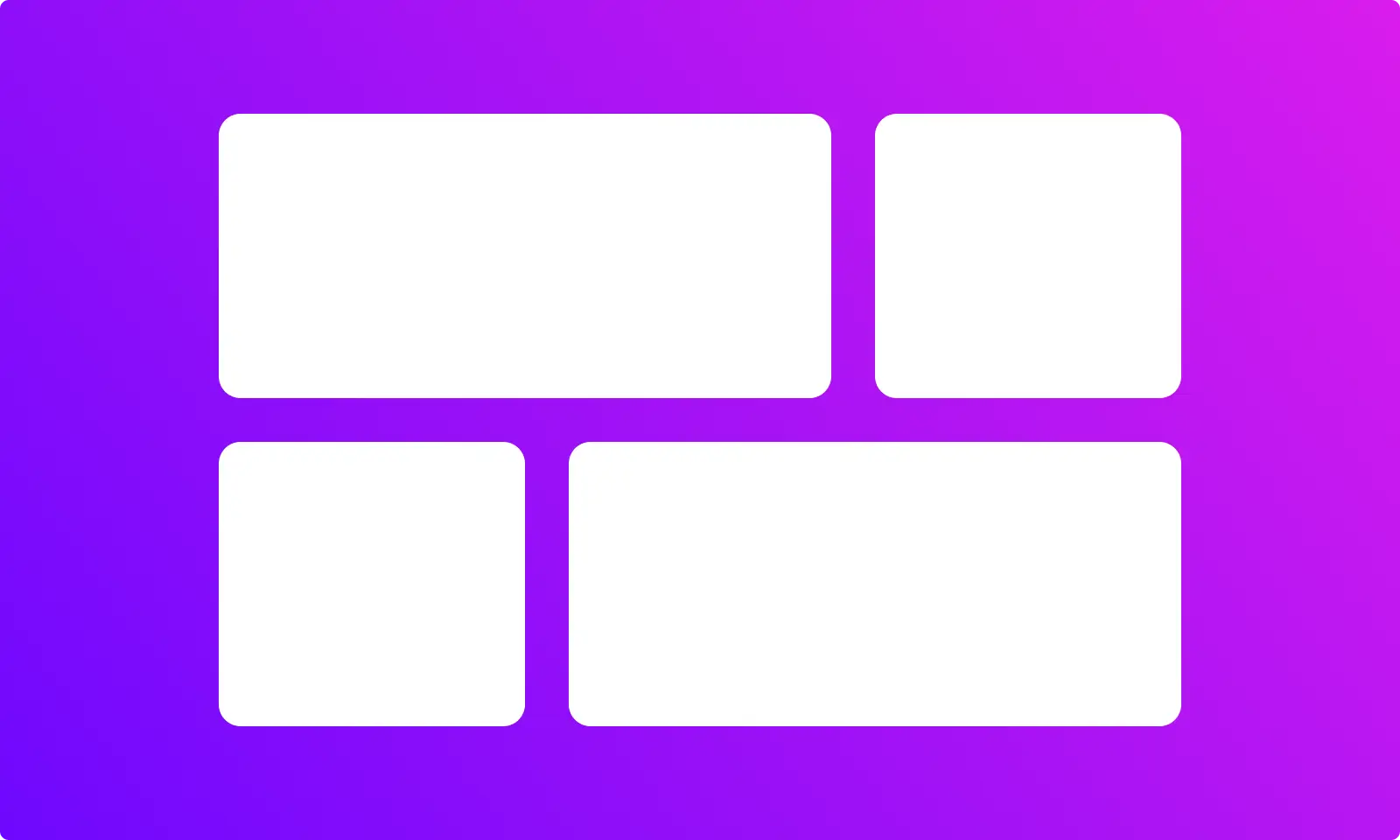
The next thing you want to have in your hero section is some sort of visual.
The goal of the graphic is to help the user visualise what they’ll get from your business.
If you sell products, show a picture of your best-selling article.
If you are a freelancer, show a photo of you.
If you offer a platform, show what it looks like.
You got the idea.
Here’s an example from the Figma website:

Social Proof
This is a super important psychology concept to know. Especially if you’re not an established business.
People often look to others’ behaviour to guide their actions, especially in ambiguous situations.
If you show your visitors that many others have already taken a particular action, they’ll be more inclined to do the same.
I literally cannot emphasise how important this concept is.
It becomes even more important if you’re not already recognised worldwide.
Apple doesn’t need to show social proof on its website because everybody has an iPhone.
But you’re not Apple. Neither am I.
So, we both need to show social proof to encourage people to take action.
There are a hundred and one ways to show social proof:
Testimonials
Real numbers
Logos of companies you’ve worked with
You got the idea.
Here’s an example from the Calendly website:

CTA
So, you’ve told your visitors what you do and how you do it, helped them visualise it, established trust, and now it’s time to make them take action.
You want to convert visitors into customers.
That’s when the CTA enters the picture.
Ideally, you want only one primary CTA in your hero section.
That doesn’t mean you can’t have two, but it means that one needs to be more prominent than the other.
Here’s an example from the HubSpot website:

As for how to write your CTA, just keep it simple and specific.
Summary
If you don’t want to go through all the points, here’s a brief summary for you:
Heading ⇒ Explain the value you provide
Description ⇒ Explain how you’re going to deliver it
Visual ⇒ Help them visualise it
Social proof ⇒ Make it believable
CTA ⇒ Convert them into customers
FAQs
Q1 - What Is A Hero Section In Design?
A hero section is the top section of a website. It’s the first thing visitors see when they land on your website. It is designed to capture their attention, communicate key messages, and encourage engagement.
Q2 - How Many Words Should Be In A Hero Section?
While there’s no hard limit, ideally, you want to keep your hero section as concise as possible. I wouldn’t go above eight words for the header and two sentences for the description.
Q3 - What Should A Hero Section Contain?
A Hero Section should contain five key elements: Header, description, visual, social proof, and a CTA.
Q4 - What Is The Difference Between Header And Hero Section?
The header is a consistent section at the top of a webpage with navigation elements, while the hero section is a visually striking area designed to make a solid first impression and communicate key messages.
Q5 - What Is The Most Important Element Of A Hero Section?
The heading is by far the most important element of a hero section. If your heading is trash, people won’t bother reading anything else on your page.
Conclusion
Thank you for taking the time to read the whole article. I hope you found it helpful.
If you need any assistance with your website, do not hesitate to reach out.
If you’ve found this article helpful, I kindly invite you to share it with a friend who might benefit from it!
Introduction
First impressions matter.
The first few seconds after a visitor lands on your website are the most critical.
That’s why getting your hero section right is so essential.
In this article, you’ll learn everything you need to know to make a perfect hero section.
What Is A Hero Section?
A hero section is the first thing people see when they land on your homepage.
It’s arguably the most important section on the whole page as it determines whether your users will stay or leave.
The goal of the hero section is to tell people what you do, why they should care, and encourage them to take action.
It’s as simple as that.
It’s usually comprised of 6 key components:
Heading
Description
Visual
Social Proof
CTA

I’ll go over each one of these and give you some tips so that you’re equipped with the necessary knowledge to make a killer hero section.
Heading
Think of the heading as your value proposition.
Its only goal is to briefly explain the value you provide to users.
I want to emphasise the word “briefly” as you don’t want to give users a full tour of everything your company does.
Be clear and concise.
Here’s a perfect example from the Stripe website:

They managed to summarise what a multi-billion dollar company does in only five words.
Keep that in mind as you’re writing your heading.
Description
Once you’ve grabbed the user’s attention with your headline, it’s time to expand on how you will deliver the value you promised.
What is it that you’re offering specifically?
Is it software? A service? A physical product? A course?
Tell your users what they can expect from you.
Here’s a perfect example from the Notion website:

Visual
The next thing you want to have in your hero section is some sort of visual.
The goal of the graphic is to help the user visualise what they’ll get from your business.
If you sell products, show a picture of your best-selling article.
If you are a freelancer, show a photo of you.
If you offer a platform, show what it looks like.
You got the idea.
Here’s an example from the Figma website:

Social Proof
This is a super important psychology concept to know. Especially if you’re not an established business.
People often look to others’ behaviour to guide their actions, especially in ambiguous situations.
If you show your visitors that many others have already taken a particular action, they’ll be more inclined to do the same.
I literally cannot emphasise how important this concept is.
It becomes even more important if you’re not already recognised worldwide.
Apple doesn’t need to show social proof on its website because everybody has an iPhone.
But you’re not Apple. Neither am I.
So, we both need to show social proof to encourage people to take action.
There are a hundred and one ways to show social proof:
Testimonials
Real numbers
Logos of companies you’ve worked with
You got the idea.
Here’s an example from the Calendly website:

CTA
So, you’ve told your visitors what you do and how you do it, helped them visualise it, established trust, and now it’s time to make them take action.
You want to convert visitors into customers.
That’s when the CTA enters the picture.
Ideally, you want only one primary CTA in your hero section.
That doesn’t mean you can’t have two, but it means that one needs to be more prominent than the other.
Here’s an example from the HubSpot website:

As for how to write your CTA, just keep it simple and specific.
Summary
If you don’t want to go through all the points, here’s a brief summary for you:
Heading ⇒ Explain the value you provide
Description ⇒ Explain how you’re going to deliver it
Visual ⇒ Help them visualise it
Social proof ⇒ Make it believable
CTA ⇒ Convert them into customers
FAQs
Q1 - What Is A Hero Section In Design?
A hero section is the top section of a website. It’s the first thing visitors see when they land on your website. It is designed to capture their attention, communicate key messages, and encourage engagement.
Q2 - How Many Words Should Be In A Hero Section?
While there’s no hard limit, ideally, you want to keep your hero section as concise as possible. I wouldn’t go above eight words for the header and two sentences for the description.
Q3 - What Should A Hero Section Contain?
A Hero Section should contain five key elements: Header, description, visual, social proof, and a CTA.
Q4 - What Is The Difference Between Header And Hero Section?
The header is a consistent section at the top of a webpage with navigation elements, while the hero section is a visually striking area designed to make a solid first impression and communicate key messages.
Q5 - What Is The Most Important Element Of A Hero Section?
The heading is by far the most important element of a hero section. If your heading is trash, people won’t bother reading anything else on your page.
Conclusion
Thank you for taking the time to read the whole article. I hope you found it helpful.
If you need any assistance with your website, do not hesitate to reach out.
If you’ve found this article helpful, I kindly invite you to share it with a friend who might benefit from it!

Luca Da Corte is a freelance Framer Expert and SEO specialist. When he’s not working on some exciting projects, he curates a blog where he shares insights, resources, and experiences on everything regarding websites.
Table Of Contents:
Table Of Contents:
Table Of Contents: